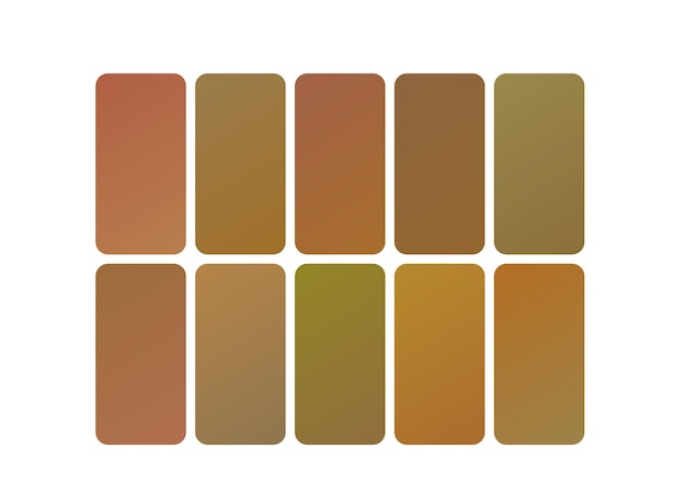
Each December, the design world (and the rest of the world, for that matter) eagerly awaits the announcement of the Pantone Color of the Year. It’s a decision that resonates across interior design, fashion, and even product development.
We’ve seen this happen in the past few decades where the Pantone color of the year selection influenced design across different sectors. In 2022, the Pantone very peri (a bluish-purple) shaped the culture in a significant way, from purple paint color throughout commercial establishments to nail polish. It was a similar case in 2023‘s color of the year with Viva Magenta.
For 2025, the chosen hue blends classic yet modern charm, evoking an earthy elegance that both grounds and energizes our surroundings.
What is the Pantone 2025 Color?
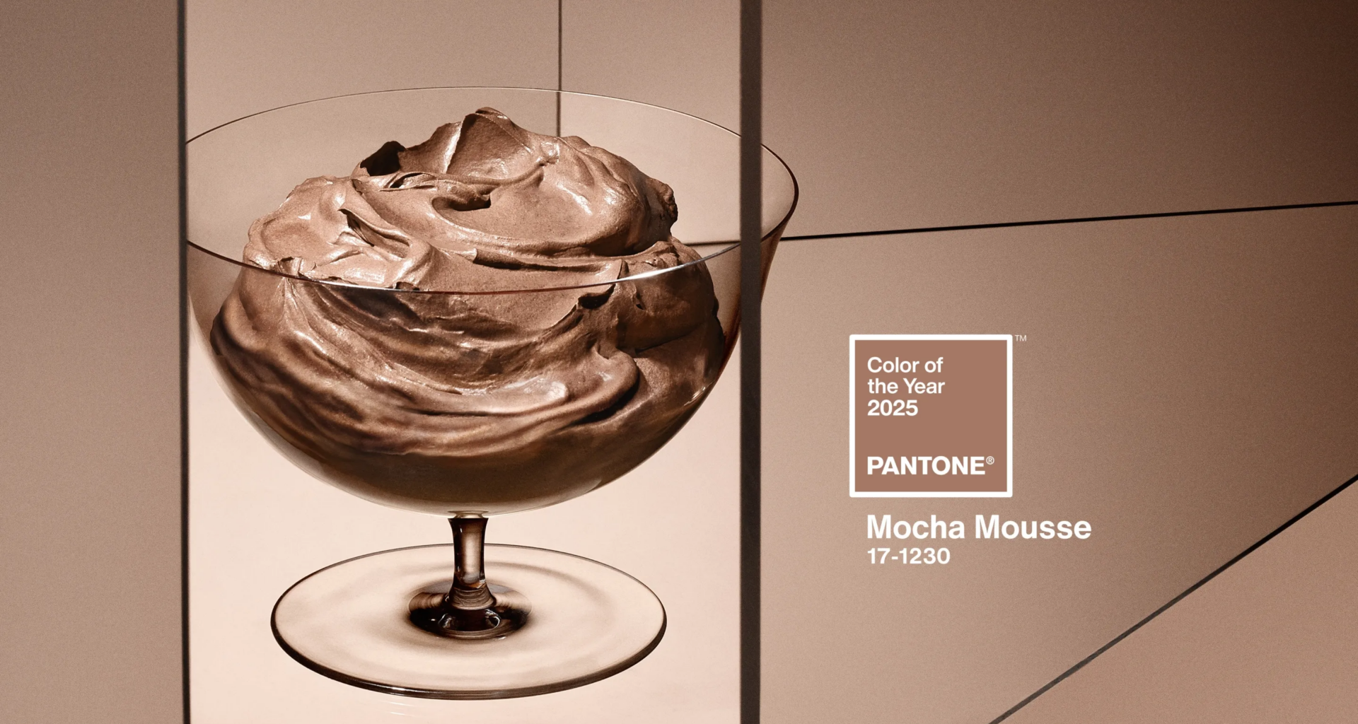
The Pantone 2025 color—a velvety brown hue dubbed “Mocha Mousse”—is already creating a buzz, offering a timeless aesthetic with modern charm.
Alongside this warm tone, supporting colors like “Mapped Blue,” “Heathered Plum,” and “Deep Ruby Red” create a versatile palette of both richness and depth. But why does this selection matter, and how will it influence trends across different industries?
Significance in Design Trends
The Pantone Color of the Year 2025 serves as both a reflection of current societal moods and a projection of future preferences. This year’s earthy hue highlights a growing trend towards embracing comfort, stability, and natural beauty.
According to Pantone’s vice president and leading color experts, these tones provide a “chameleon-like quality” that adapts seamlessly to various design styles.
Interior Design Applications: Entire Rooms and Accents
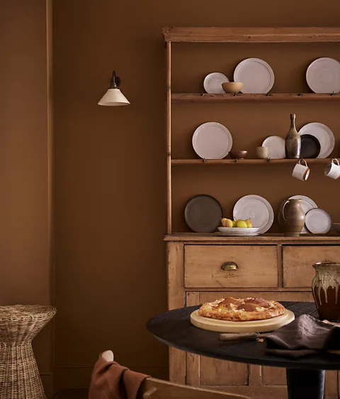
Whether you’re decorating an entire room or introducing subtle accents, Mocha Mousse offers a lasting statement that feels equally at home in contemporary or traditional spaces in the Philippines.
Pairing it with shades like “Mapped Blue” or “Heathered Plum” creates moments of serene elegance, while brighter tones like “Deep Ruby Red” or “Purple Basil” inject energy and intrigue.
Four Walls: Mocha Mousse to paint all four walls of a room is a stunning way to add warmth and dimension without overpowering the space.
Color Capsule: Integrating supporting hues like “Mapped Blue” and “Deep Ruby Red” ensures versatility within a “color capsule” that complements furniture, textiles, and art.
Nature-Inspired Accents: Mocha Mousse’s connections to earthy beauty pair well with materials like reclaimed wood, stone, and metal to create a grounded ambiance.
Furniture and Architectural Highlights
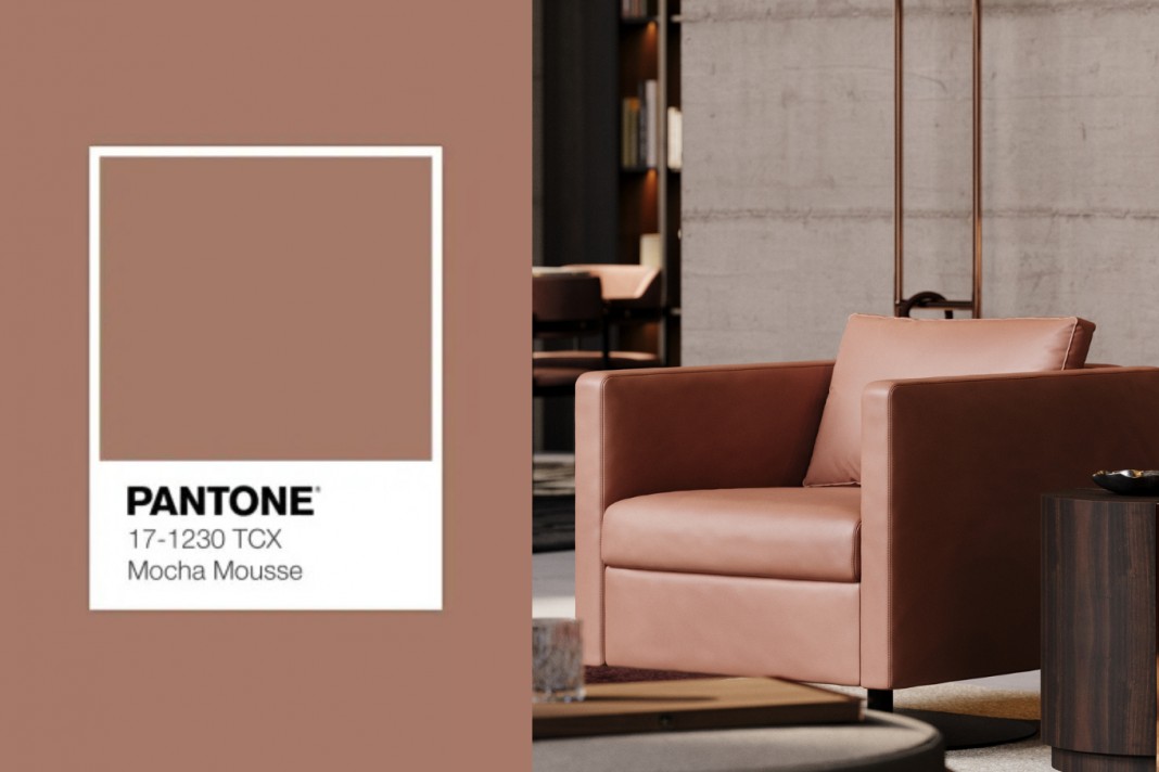
Modern furniture and architecture are increasingly gravitating towards timeless aesthetics with a tactile edge. For example, combining a Mocha Mousse leather sofa with hammered black fixtures brings in the rich texture of a modern take on rustic design.
Krylon’s Color Marketing Manager emphasized how spray paint in hues like “Mocha Mousse” or “Mapped Blue” answers the need to reinvent old furniture for a sleek update.
In architectural spaces, Sherwin Williams colors like “Heathered Plum” or “Mapped Blue” make dramatic choices for accent walls or trim, blending seamlessly with modern interiors.
For homeowners looking to renovate, incorporating “Mocha Mousse” and “Deep Ruby Red” into exterior finishes ensures a welcoming yet chic facade.
Color of the Year of Different Paint Companies

Key players in the industry are already aligning their 2025 palettes with this significant shift in color preferences:
Benjamin Moore and Behr Paint Company have introduced variations that lean into earthy and jewel-like shades, ensuring that this year’s selection suits diverse design needs.
Sherwin Williams’ Color of the Year, “Timeless Red,” shares a thematic harmony with “Deep Ruby Red,” showcasing how layered tones can evoke mysterious beauty and energy.
Brands like Dutch Boy and Dunn Edwards are offering collections designed to mix velvety brown with complementary tones for easy integration.
The rise of multifunctional “color capsules” mirrors consumers’ desire for seamless coordination across indoor and outdoor environments. From a bold statement wall to a subtle accent piece, companies like C2 Paint and HGTV Home recognize the need for paint colors that both inspire and offer durability.
Bridging Generational Preferences
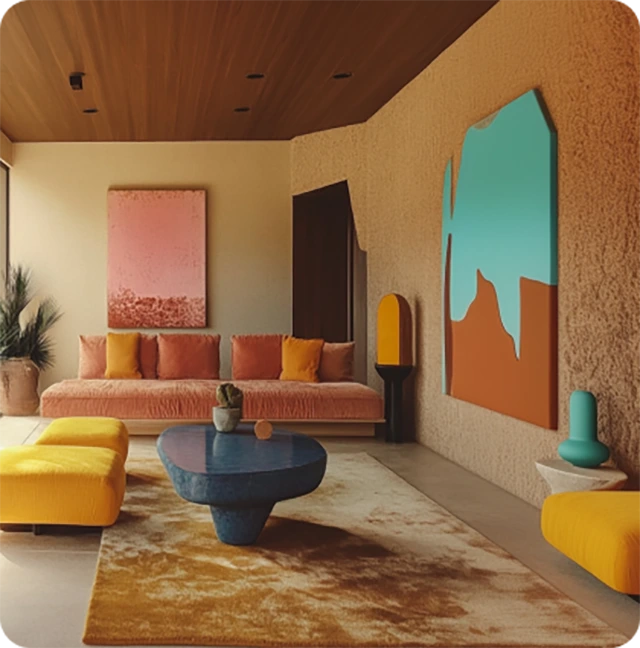
This 2025 color capsule appeals across generations. While Gen Zs lean toward self-expression through bold pairings, older generations favor classic yet modern charm in shades like “Mocha Mousse” and “Heathered Plum.”
These tones are versatile, offering both timeless appeal and contemporary relevance. Whether used in bold strokes or soft, serene moments, they encourage creativity within all design styles.
Outdoor Design and Beyond
Incorporating the Pantone Color of the Year into your home’s exterior can create an eye-catching effect. Deep Ruby Red doors or shutters paired with a brown-based facade exude a sense of rooted elegance.
For outdoor spaces, incorporating “Mapped Blue” on outdoor furniture or planters adds a stunning modern charm.
Contemporary Industries
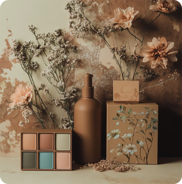
Any major brand doing new product launches or marketing campaigns is taking a cue from Pantone color of the year 2025. A recent press release by Benjamin Moore’s color marketing manager highlights the shift toward nature-inspired shades and energetic appeal.
Similarly, creative services at companies like Sherwin Williams and Dunn Edwards note that embracing these tones creates spaces where people truly feel connected and comfortable.
Timeless Combinations for a Lasting Impact
Combining modern takes on classics with emerging trends ensures that this significant shift becomes a staple for years to come. Using a color like Cinnamon Slate in various design styles allows flexibility without sacrificing timeless aesthetics. For instance:
Pairing “Cinnamon Slate” with heathered plum and “Timeless Red” creates an energetic yet rooted palette.
Adding “Mapped Blue” or “Purple Basil” brings a brighter, serene charm ideal for bathrooms or small rooms.
Experimenting with accents in Deep Ruby Red provides a pop of sophisticated intrigue that anchors any space.
2025 Color of the Year Mocha Mousse: Refined and Understated
The Pantone Color of the Year 2025 highlights how people embrace color to create harmony in their living environments. The blending of familiar comfort with innovative combinations—as seen in tones like Cinnamon Slate and its companions—creates designs that transcend seasons.
Whether through a bold accent wall, a refreshed piece of furniture, or an entire room transformation, this chameleon color speaks to a universal desire for beauty, balance, and connection.
As we move into 2025, this palette’s influence will extend beyond interiors to fashion, technology, and even global branding strategies.
It’s a reminder of the transformative power of color—a stunning way to add warmth, creativity, and connection to any space. With options that range from adventurous to grounded, this collection truly offers something for everyone.

Celebrate Life’s Milestones in Camella!
House and Lot & Condominium for Sale in the Philippines


